The need
A broad and specialist range needed more than a price list. The material had to explain quality, processing and choice while staying useful to buyers.
A visual and editorial system that turns a specialist product range into a clear, credible and distinctive story.
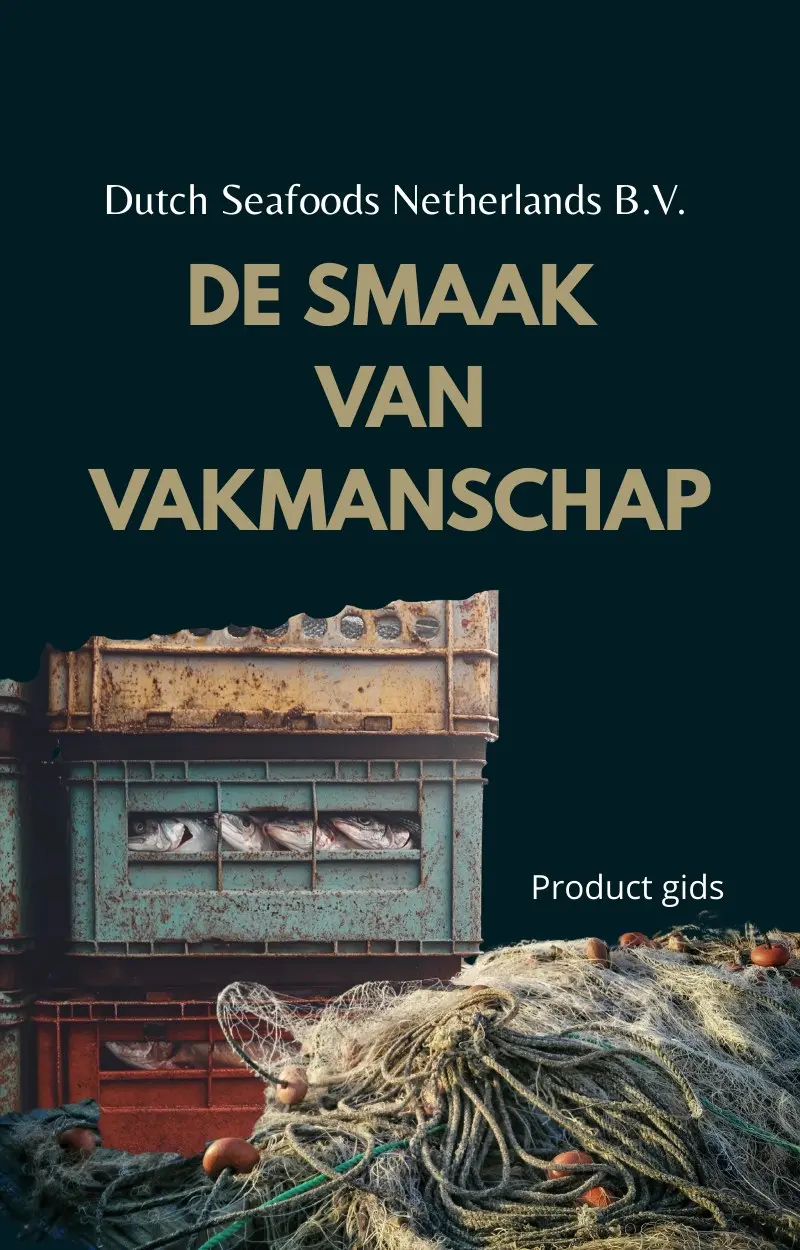 Product guide / Brand system
From daily catch to thirty-page guide: make expertise visible without losing character.
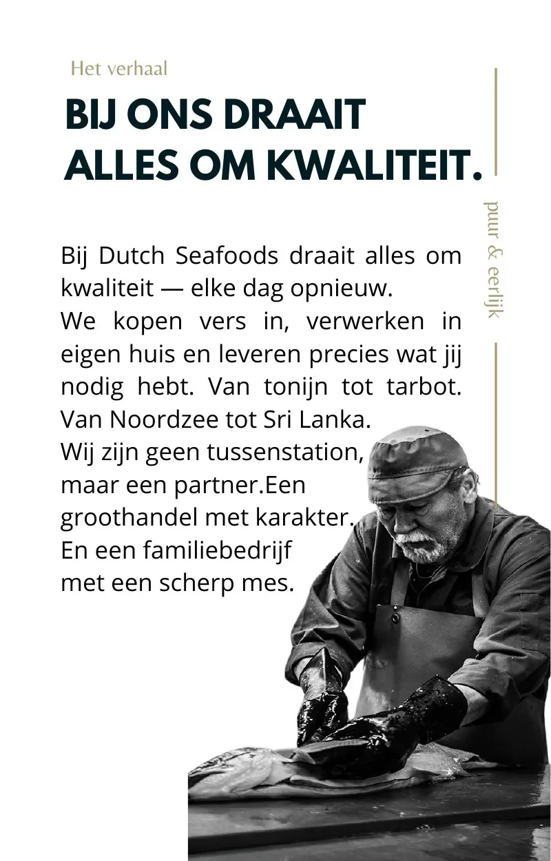
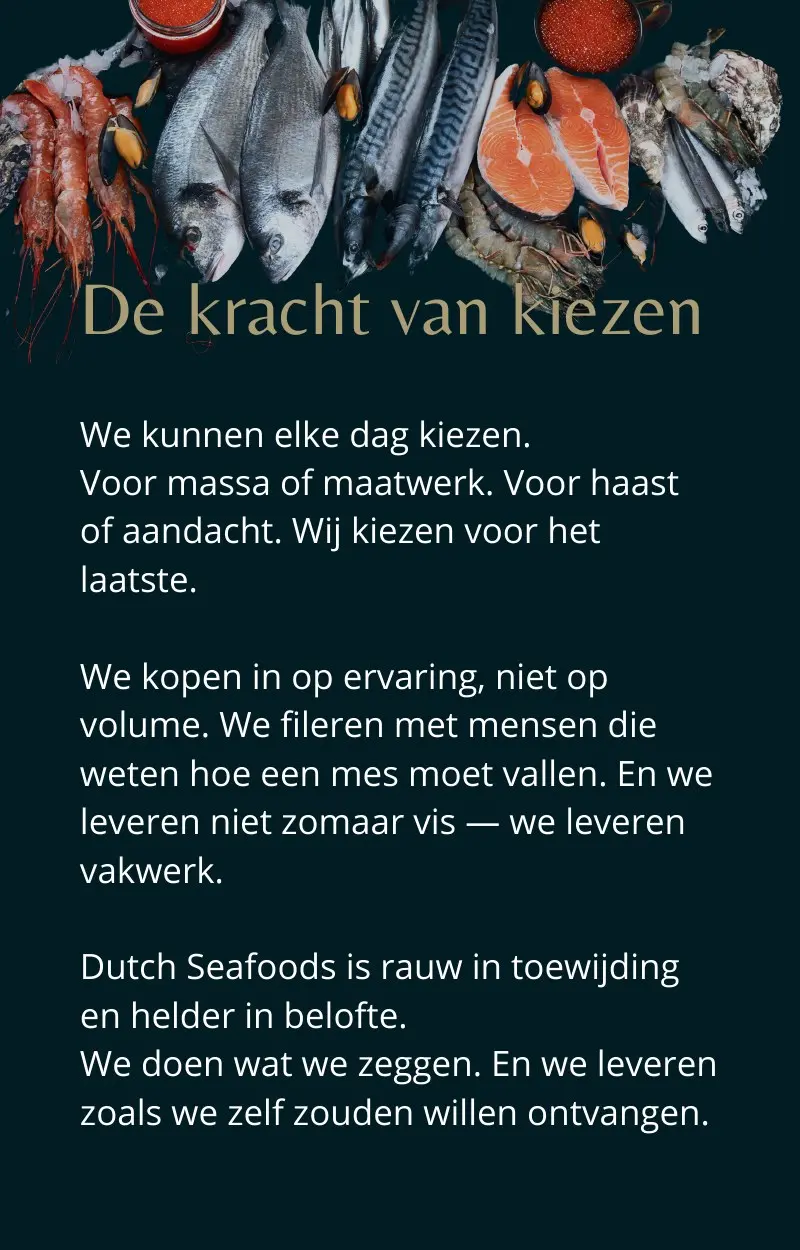
A broad and specialist range needed more than a price list. The material had to explain quality, processing and choice while staying useful to buyers.
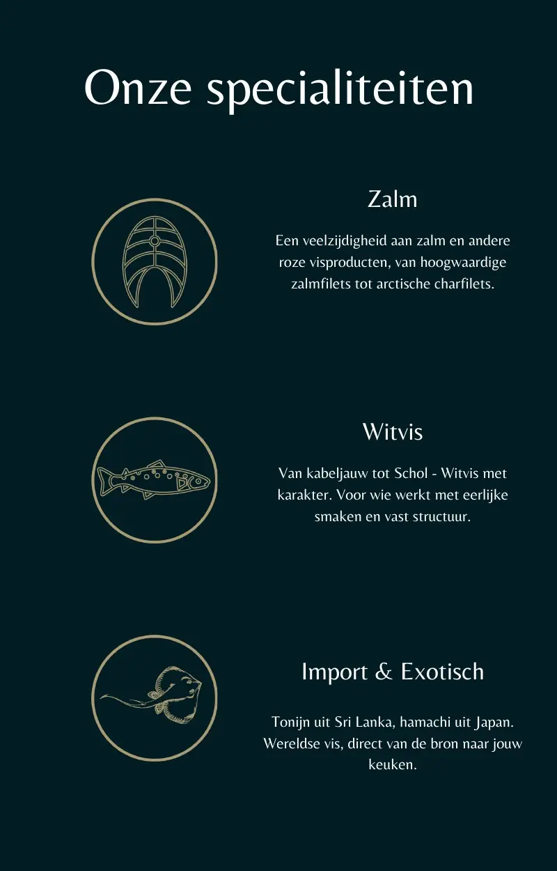
Deep marine green, warm metallic tones, clean product cut-outs, line illustrations and strong editorial pacing create coherence across categories.
The system extends from a long-form product guide to Dutch SushiFoods and compact sales material, without losing the parent brand’s character.
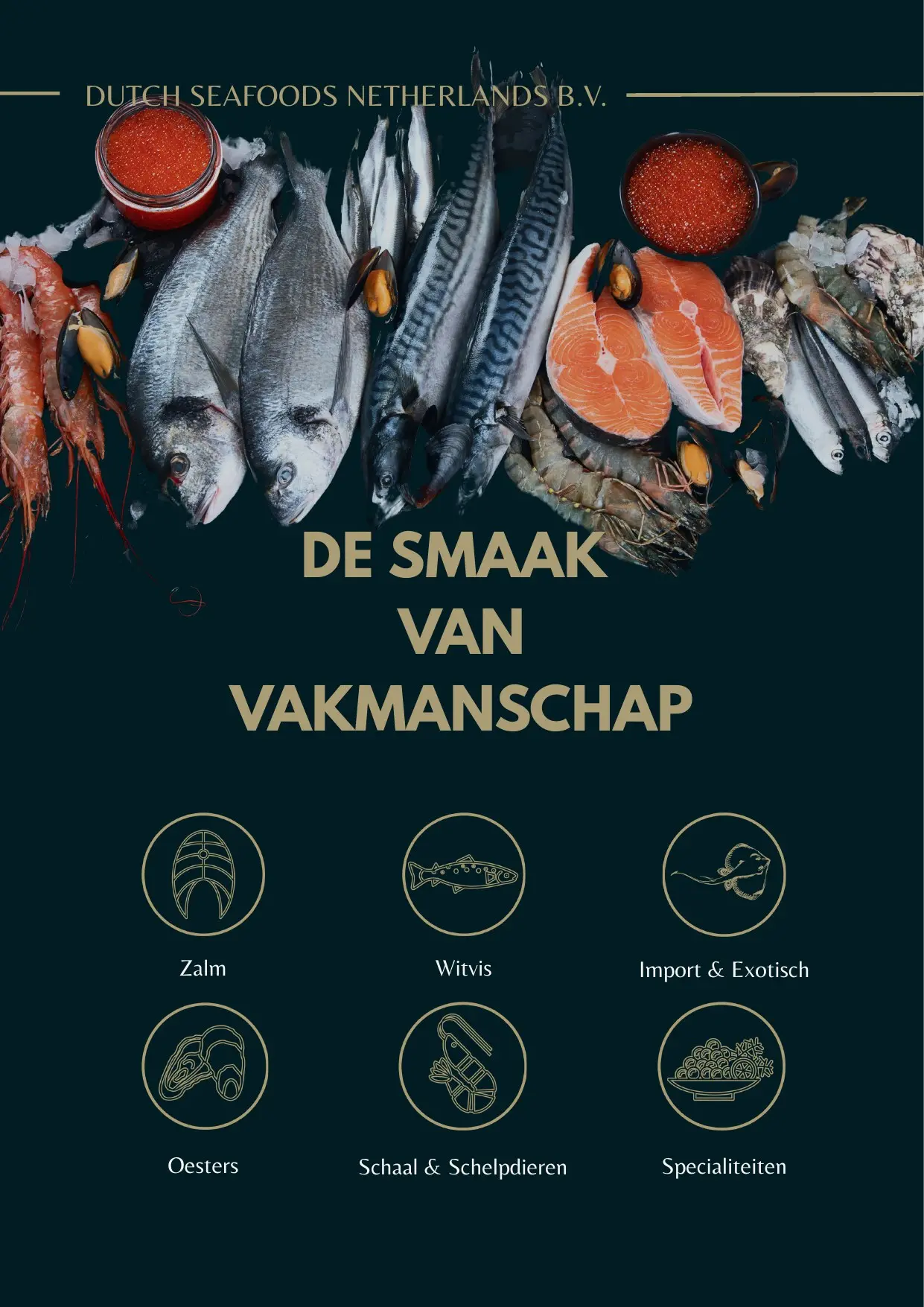
A compact introduction designed to lead directly into the complete product range.