The brief
Create an identity for a fictional coastal guesthouse that feels culturally alive, design-aware and welcoming — without relying on familiar luxury-hotel codes.
A design-led coastal guesthouse imagined as a place to arrive, reset and create.
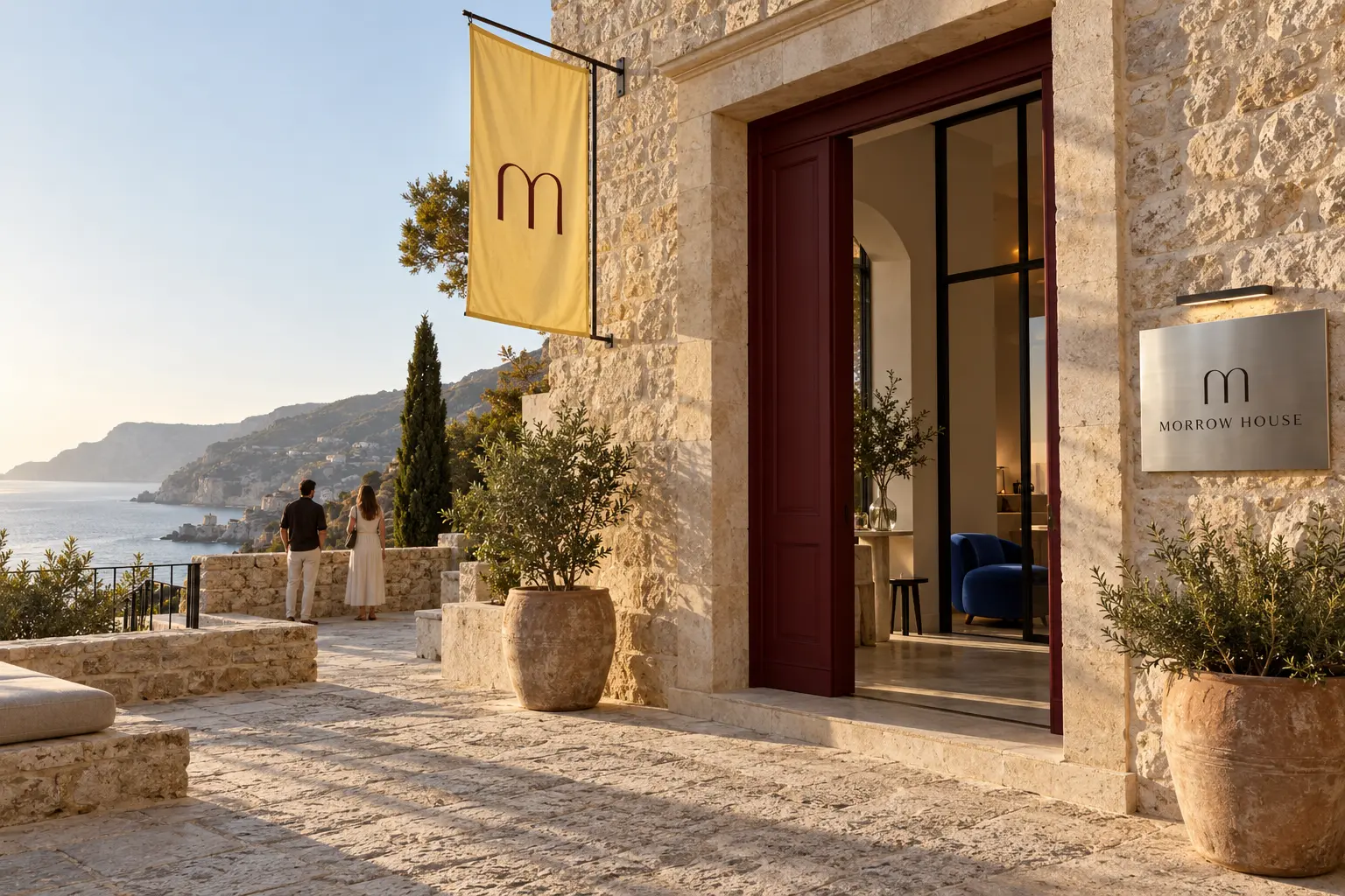 Brand world / 01
Quiet architecture. Expressive colour. A stay with its own point of view.
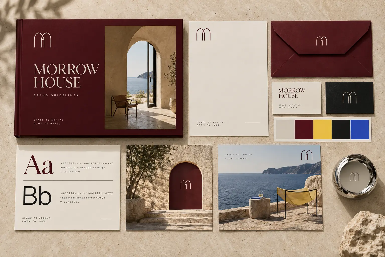
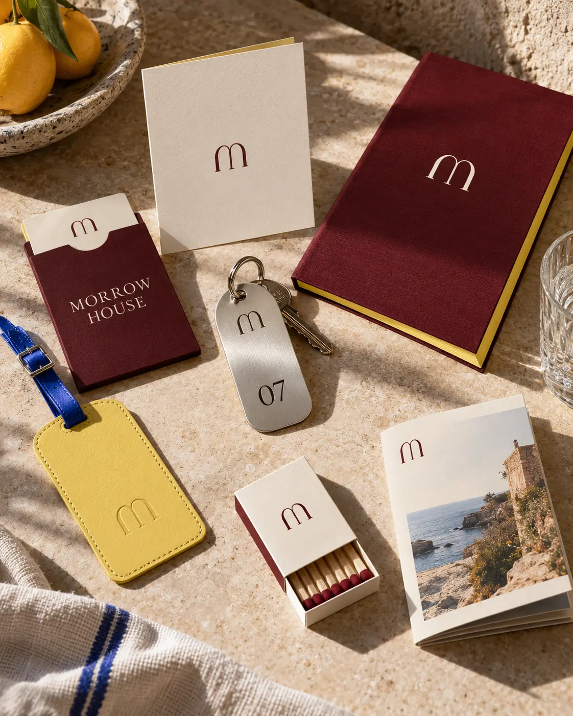
Create an identity for a fictional coastal guesthouse that feels culturally alive, design-aware and welcoming — without relying on familiar luxury-hotel codes.
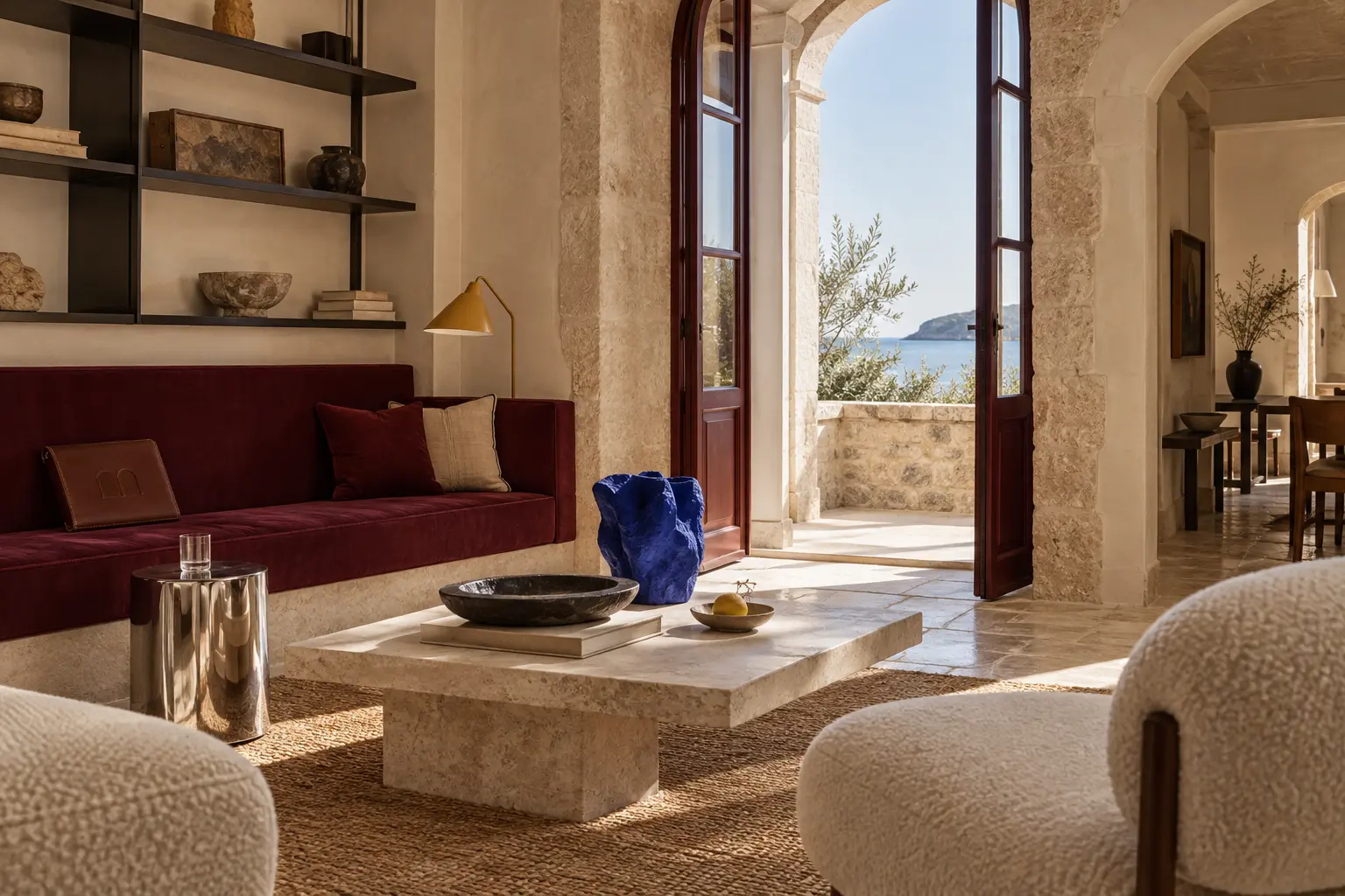
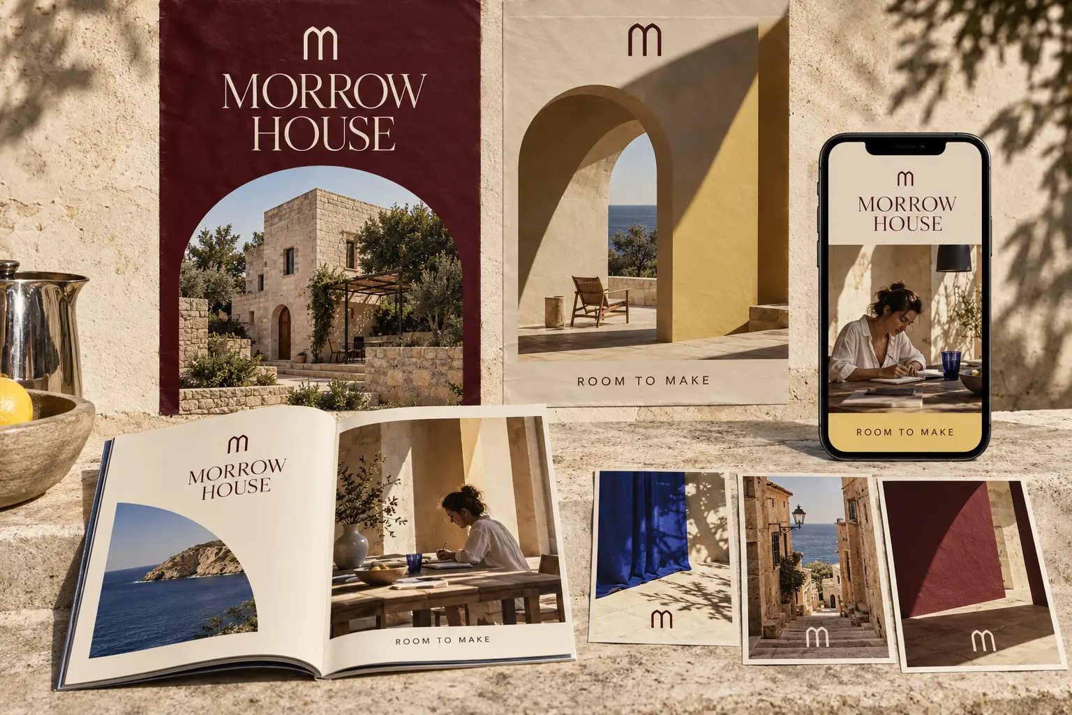
The architecture stays calm while oxblood, butter yellow and ultramarine add energy. One simple arch language connects sign, symbol, pattern and frame.
A flexible direction designed to hold every guest encounter: before arrival, inside the house and in the stories that travel beyond it.
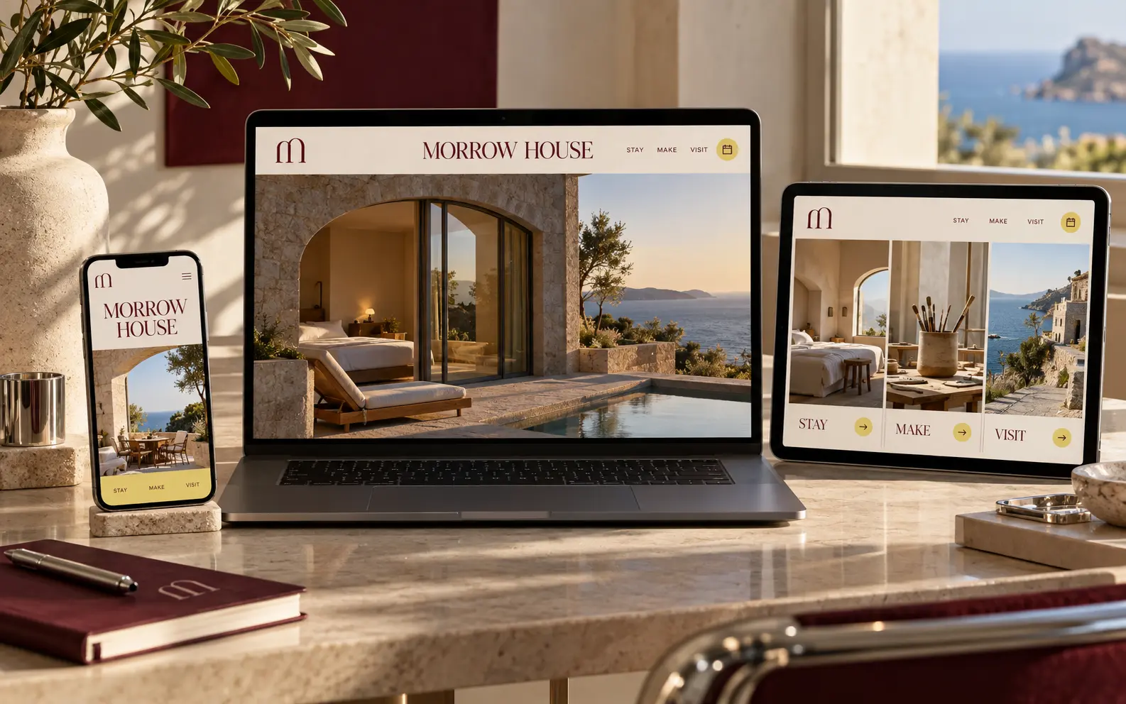
A calm booking journey with expressive editorial moments.
This is a self-initiated concept developed to demonstrate Melanie’s approach. The imagery was AI-assisted and art-directed specifically for this portfolio presentation.